Why Choosing the Best Data Visualization Tool Matters for Growing Teams?
In today’s fast-paced business world, data is everywhere. Companies collect information from websites, social media, apps, emails, and more. But raw data alone does not help much. Teams need to see the data in ways they can understand. This is where data visualization comes in.
Choosing the Best Data Visualization Tool is not just a technical choice. It is a decision that affects how well a team can understand its goals, track progress, and make smart choices.
What Is Data Visualization?
Turning Numbers into Visual Stories
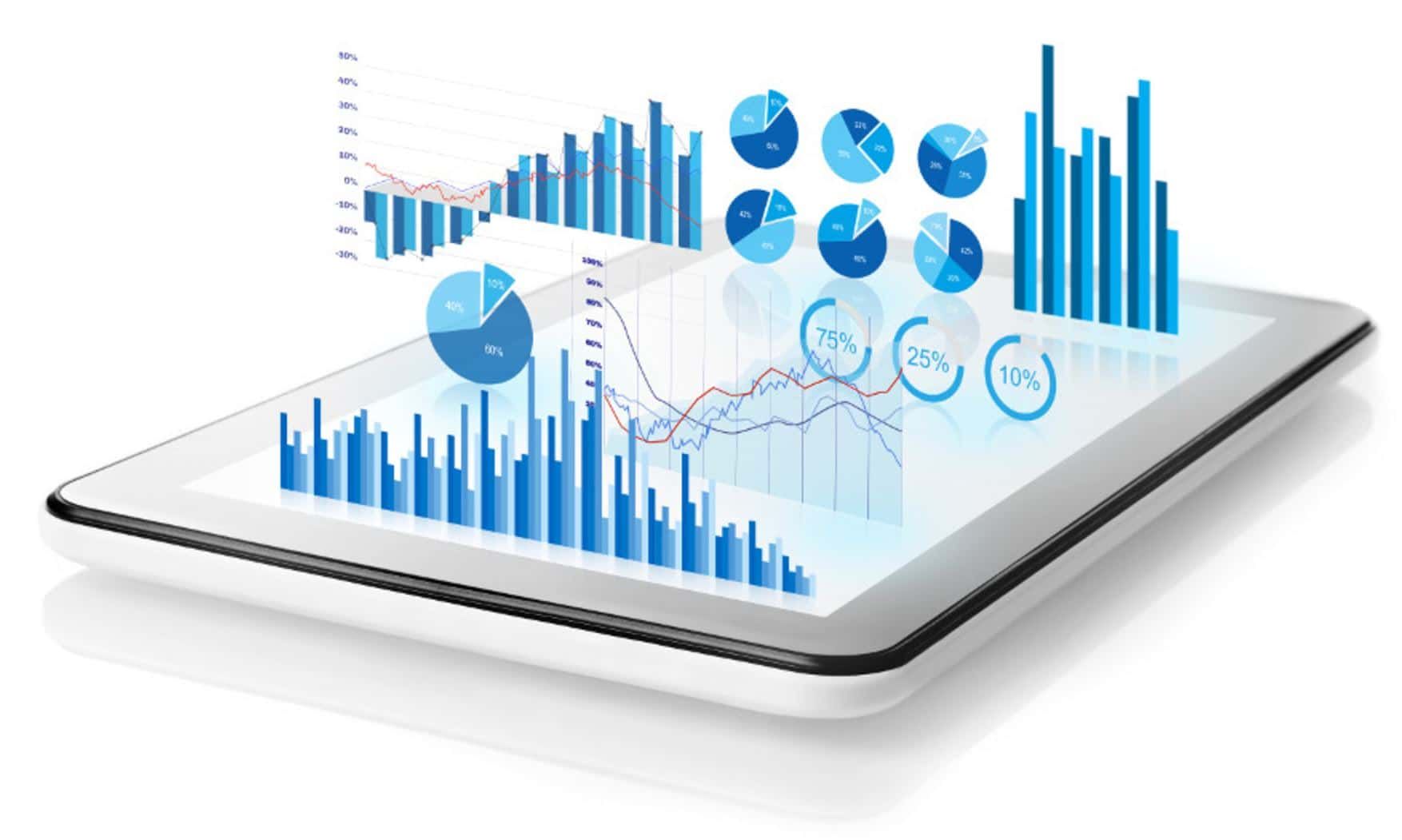
Data visualization is the process of turning numbers and complex information into charts, graphs, maps, and dashboards. This makes it easier for people to see patterns, trends, and outliers. For example, instead of reading a long table of sales data, a line chart can show how sales have grown or dropped over time.
Helps Everyone Understand Data
One of the biggest benefits is that it makes data easier to understand. Not everyone is a data expert, but most people can understand a well-made chart or dashboard. This helps team members from different departments work together better.
Why Teams Need the Right Tool to Handle Data
Teams Are Growing and Handling More Information
As businesses grow, so does the amount of data they handle. A growing team needs to manage:
- Sales figures
- Marketing campaign performance
- Customer feedback
- Website traffic
- Financial reports
Trying to track all this with basic tools like spreadsheets can be difficult. The Best Data Visualization Tool helps organize, view, and share this information easily.

Saves Time and Reduces Errors
Manually creating reports or charts from spreadsheets is time-consuming and increases the chances of mistakes. A good tool automates this process. It pulls in live data and shows it in visual formats, reducing the need for manual work.
Key Features to Look for in the Best Data Visualization Tool
1. Easy to Use for Everyone
Look for a tool that doesn’t need advanced training. The interface should be simple and user-friendly so even non-technical team members can use it with confidence.
2. Real-Time Data Updates
The tool should connect with data sources and update dashboards in real-time. This helps teams react quickly when something changes, such as a drop in website traffic or a sudden spike in sales.
3. Customizable Dashboards
Every team has different needs. A good tool lets you customize charts and dashboards to match your goals. For example, the marketing team might focus on campaign performance, while the finance team might want to track revenue trends.
4. Data Sharing and Collaboration
The best tools allow team members to view, edit, and comment on dashboards. This improves communication and helps everyone stay on the same page.
How the Best Data Visualization Tool Helps Teams Grow
Makes Better Decisions, Faster
When data is clear and easy to understand, teams can make quicker and more confident decisions. Whether it’s launching a new product, planning a campaign, or improving customer service, having the right data in front of you makes all the difference.
Supports Team Collaboration
Teams are often spread across different locations. With the right tool, everyone can access the same dashboard from anywhere. This supports remote teams and helps people work together smoothly.
Tracks Progress Towards Goals
Growing teams need to track performance often. Dashboards can show weekly or monthly progress toward targets. This helps managers spot issues early and adjust plans when needed.
Encourages a Data-Driven Culture
When everyone in a team uses the same tool to understand data, it creates a habit of using facts not guesses to guide work. Over time, this builds a strong data-driven culture.
Real Examples of How Growing Teams Use Data Visualization
Example 1: Marketing Team
A marketing team uses data visualization to track how many people visit the website, how long they stay, and which pages they like most. They can also compare the success of different email campaigns or social media posts all in one dashboard.
Example 2: Sales Team
A sales team can use dashboards to track deals, targets, and client engagement. They can spot which regions are doing well and which need more attention.
Example 3: Operations Team
An operations team may track product deliveries, service delays, or inventory levels. Charts can help identify slow areas in the supply chain and make improvements faster.
Challenges Teams Face Without a Good Tool
Information Overload
When teams don’t have a central tool to view their data, it gets scattered across emails, spreadsheets, and presentations. This makes it harder to keep track of important information.
Miscommunication
Without clear visuals, different team members may understand the same data in different ways. This leads to confusion, delays, and poor decisions.
Missed Opportunities
When trends or problems are not spotted early, teams miss out on chances to grow or fix issues in time. The Best Data Visualization Tool helps prevent this.
Steps to Choose the Best Data Visualization Tool
Step 1: Define Your Goals
Know what you want to track. Is it customer behavior? Financial performance? Website visits? The right tool should match your needs.
Step 2: Involve Your Team
Talk to the people who will use the tool. What do they need to see? What’s hard about their current process?
Step 3: Try Before You Decide
Most tools offer free trials. Test a few options with real data before making a decision. See which one fits your team best.
Step 4: Think About Growth
Pick a tool that can grow with your team. As your business expands, your data will too. The tool should be able to handle more data and more users over time.
What Growing Teams Gain from Using the Best Data Visualization Tool
- Clear view of what’s working and what’s not
- Faster and smarter decision-making
- More teamwork and fewer mistakes
- Less time spent on manual reports
- Stronger focus on goals and results
These benefits help teams grow not only in size but also in performance and confidence.
How to Get Started with a Data Visualization Tool
- Pick a tool that matches your goals
- Connect your current data sources
- Build dashboards for each team
- Set up sharing and access options
- Review and update dashboards regularly
Once set up, your team will quickly see the difference in how they view and use data every day.
Conclusion:
In any growing business, data is one of the most powerful tools. But to use it well, teams need to see it clearly. Spreadsheets and scattered reports won’t work anymore. What teams need is a tool that turns complex numbers into simple visuals.
Choosing the Best Data Visualization Tool helps growing teams stay focused, save time, and make better decisions. It brings teams closer to their goals by making data more accessible and easier to use.
If you want to help your team grow faster and work smarter, now is the right time to invest in the best tool for the job.







Post Comment