Introduction
User experience (UX) plays a pivotal role in the success of a mobile app. A well-optimized UX can determine whether users stay engaged or abandon an app after a few seconds.
Optimizing Mobile App UX – Enhancing Seamless Interaction for User Satisfaction is not just about aesthetics but also about understanding human psychology. The way users perceive colors, typography, and layout can significantly influence their behavior, emotions, and overall engagement with an app.
This article explores the psychology behind mobile UX and provides actionable insights into how colors, typography, and layout can improve usability, increase retention, and enhance user satisfaction.
The Importance of Mobile UX Psychology
Mobile UX is more than just design, it’s about creating an intuitive and engaging experience that resonates with users on a psychological level. The brain processes visuals faster than text, meaning that every design choice impacts how users interact with an app. Understanding the psychology behind mobile UX helps designers craft experiences that feel natural, appealing, and rewarding.
How Psychology Influences User Interaction
- Cognitive Load: Reducing unnecessary information ensures a smooth experience.
- Visual Hierarchy: Guides users’ attention and improves usability.
- Emotional Design: Triggers positive emotions to encourage engagement.
- Decision-Making: Well-structured UI elements help users make choices easily.
Let’s dive deeper into the three key elements of mobile UX psychology: colors, typography, and layout.
The Psychology of Colors in Mobile UX
Colors evoke emotions and influence user behavior. In mobile UX design, choosing the right color scheme can enhance readability, create a positive impression, and encourage users to take action.
Color Associations in UX
Different colors trigger various emotional and psychological responses:
|
Color |
Psychological Effect |
Usage in UX |
|
Blue |
Trust, security, calmness |
Often used in banking and healthcare apps |
|
Red |
Urgency, excitement, passion |
Used for notifications, alerts, and CTA buttons |
|
Green |
Growth, harmony, balance |
Common in finance, health, and sustainability apps |
|
Yellow |
Optimism, happiness, caution |
Used for highlights and warning messages |
|
Black |
Sophistication, elegance, power |
Popular in luxury and tech branding |
Color Contrast and Accessibility
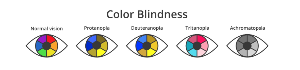
High contrast improves readability and accessibility, ensuring an inclusive user experience. Designers should follow WCAG (Web Content Accessibility Guidelines) to make apps usable for people with visual impairments.
Additionally, using color psychology effectively can enhance brand recognition and emotional connection. For instance, social media platforms like Facebook and Twitter use blue to establish trust, while entertainment apps like Netflix use red to evoke excitement and urgency.
Typography: The Role of Fonts in UX Psychology
Typography affects how users process information. A well-chosen font enhances readability, while poor typography can frustrate users and lead to high bounce rates.
Font Types and Their Psychological Impact
|
Font Type |
Psychological Effect |
Usage in UX |
|
Sans-serif |
Modern, clean, easy to read |
Preferred for mobile apps |
|
Serif |
Traditional, authoritative |
Used in formal and academic apps |
|
Script |
Creative, elegant |
Common in luxury and lifestyle apps |
|
Monospace |
Technical, coding feel |
Used in developer and data-heavy applications |
Best Practices for Mobile Typography
- Font Size: Ensure text is legible on small screens (14-16px for body text).
- Line Spacing: Use appropriate spacing to enhance readability.
- Contrast: Dark text on a light background improves visibility.
- Font Pairing: Combine fonts wisely to maintain consistency and readability.
Additionally, typography influences perceived credibility. Research suggests that people perceive information in serif fonts as more authoritative, while sans-serif fonts create a modern and user-friendly appeal.
The Impact of Layout and Structure on Engagement
A well-structured layout improves navigation, reduces cognitive load, and enhances usability.
Key Layout Principles in Mobile UX
- Visual Hierarchy – Place important elements where users expect them.
- Whitespace – Improves clarity and helps users focus on key actions.
- Navigation Patterns – Use familiar patterns (hamburger menu, bottom navigation).
- Gestures & Microinteractions – Improve engagement with subtle animations.
The Role of Simplicity in UX
Minimalist design reduces distractions and enhances usability. Overloading users with information can lead to decision fatigue and app abandonment.
In addition to structure, motion design elements like animations and microinteractions can improve engagement by providing feedback and guiding users through the interface seamlessly.
How to Optimize Mobile UX for Better Engagement
1. Use Psychology-Driven Design Choices
Leverage emotional design principles to create a more intuitive and satisfying user experience.
2. Prioritize User-Centered Design (UCD)
Conduct usability testing, gather feedback, and iterate designs to improve engagement.
3. Ensure Accessibility for All Users
Implement inclusive design practices to cater to diverse user needs.
4. Optimize Performance and Speed
Fast-loading apps with seamless navigation improve retention rates.
5. Maintain Consistency Across Devices
Ensure design consistency across multiple screen sizes and platforms.
Frequently Asked Questions (FAQs)
How do colors influence user engagement in mobile apps?
Colors evoke emotions and drive actions. The right color choices can enhance trust, encourage interaction, and improve readability.
What is the best font style for mobile UX?
Sans-serif fonts like Roboto and Open Sans are best for mobile due to their readability and modern appeal.
Why is whitespace important in mobile UX design?
Whitespace improves readability, reduces cognitive load, and helps users focus on key content.
How does visual hierarchy impact mobile UX?
A well-structured visual hierarchy guides users’ attention and improves navigation, ensuring a seamless experience.
What is the role of accessibility in mobile UX?
Accessibility ensures that all users, including those with disabilities, can interact with the app effectively.
How can I optimize my mobile app’s UX for better retention?
Focus on intuitive navigation, fast performance, accessibility, and visually appealing design elements.
Conclusion
Understanding the psychology behind mobile UX is crucial for creating user-friendly apps that drive engagement and satisfaction. By optimizing colors, typography, and layout, designers can craft seamless experiences that appeal to users both aesthetically and functionally. Prioritizing Optimizing Mobile App UX – Enhancing Seamless Interaction for User Satisfaction ensures that mobile applications not only look good but also provide a meaningful and enjoyable experience.
By leveraging the right UX principles, businesses can boost user retention, improve usability, and create apps that stand out in a competitive digital landscape.


Leave a Reply